Today's postings
- [Baren 40432] Re: Harper College Small Works Show prospectus (Louise Cass)
- [Baren 40433] Where is Ira? (Charles Morgan)
- [Baren 40434] 2nd. Penang International Print Exhibition 2010 (Rahman Mohamed)
- [Baren 40435] 2nd. Penang International Print Exhibition 2010 (Rahman Mohamed)
- [Baren 40436] Baren Member blogs: Update Notification (Blog Manager)

Message 1
From: Louise Cass
Date: Wed, 20 Jan 2010 17:13:01 GMT
Subject: [Baren 40432] Re: Harper College Small Works Show prospectus
Send Message: To this poster
I've noticed that there are a number of Shows with that restriction...a
pity for us nearby in Canada...
Louise

Message 2
From: Charles Morgan
Date: Wed, 20 Jan 2010 22:36:34 GMT
Subject: [Baren 40433] Where is Ira?
Send Message: To this poster
Cheers ........ Charles
Message 3
From: Rahman Mohamed
Date: Thu, 21 Jan 2010 06:23:49 GMT
Subject: [Baren 40434] 2nd. Penang International Print Exhibition 2010
Send Message: To this poster
Message 4
From: Rahman Mohamed
Date: Thu, 21 Jan 2010 07:24:29 GMT
Subject: [Baren 40435] 2nd. Penang International Print Exhibition 2010
Send Message: To this poster
Apologise for multiple post. Part of my mail didn't appear/ missing.
Here is the missing part :
The organizing committee would like to invite artist printmakers from around the world to submit their work for the exhibition. Print(s) should reach the organiser no later than June 30th., 2010.
Rules for entry together with the application form could be downloaded from the official website :
http://www.usm.my/art/penangprint2010/
--
Rahman Mohamed
2nd. Penang International Print Exhibition 2010
School of The Arts
Universiti Sains Malaysia
11800 Penang, MALAYSIA
Digest Appendix
Postings made on [Baren] members' blogs
over the past 24 hours ...
Subject: Desert Island Prints
Posted by: Dave Bull
|
While carving this afternoon, I was listening to the (wonderful) iPlayer from the BBC in England, and enjoyed an episode of the very long-running program Desert Island Discs. You are probably familiar with the idea ... the host interviews a guest, who chooses ten records that he would take if he were to be stranded on a desert island. It's always an enjoyable listen, and each of the guests always has to explain just why these particular choices were made. It occurred to me that we here on [Baren] could easily play the same game, so I'll give it a try - not with 10 prints, which would be a bit much, but with three. Here they are (images are clickable for enlargements):  My third print is one that I don't actually own, but perhaps the BBC can afford to buy a copy for me when they strand me on the island. It was created in 1942 by the French designer Paul Jacoulet, being produced to his (exacting) specifications by his hired workmen, Kentaro Maeda the carver, and Shunosuke Fujii the printer (with three assistants). Le Bocal de Poissons Rouge It is perhaps fairly obvious why this is a 'desert island' choice - there is enough detail here to keep any viewer rapt for a very long time indeed. Jacoulet cut his own path through the world, and I'm not an uncritical fan of everything he was involved with, but with work like this, he earned my complete respect. I want to produce work of this quality one day! The second one that I will take with me is one that I own. And the fact that I have had it for many years, and yet would still take it with me, is proof of it's appeal! It is a Meiji-era kuchi-e, one of the prints created as frontispieces for literary magazines of the day. Woman with Poetry Card I have written quite extensively about this print in other places, so simply present it here for your enjoyment. For my Number One choice to take to the island, I am selecting a reproduction print from my collection - a design by Utamaro. This copy was made somewhere around late Meiji, or perhaps in the Taisho era. This was when the level of craftsmanship was at it absolute peak, . . . |
This item is taken from the blog BarenForum Group Weblog.
'Reply' to Baren about this item.
Subject: Still Carving
Posted by: Annie B
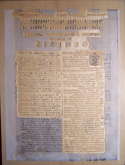 No surprise here: I'm still carving my page from John Eliot's Wampanoag Bible. I have about two more day to go, I think. Just to be clear about my process, although I began the project using a traditional Japanese toh (straight blade), I soon changed tools and began using a #2 X-acto blade. 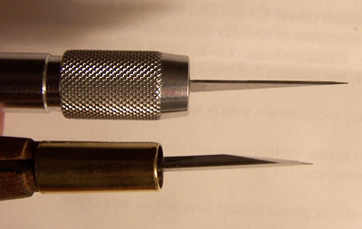 #2 X-acto blade (top) and traditional toh (bottom) compared I know that there are some awesome carvers out there who could do this with a toh no problem. I thought I could do it given that I've finally mastered the art of sharpening my toh, but I found the thickness of the blade to be problematic with these tiny letters. Because I'm using plywood, it's awfully easy to pop off the little dots on the i's , commas, accent marks etc. The blade of the toh, although just as sharp as an X-acto blade, gets thick as you move away from the point. The angle of the blade is less acute (less pointed) than the X-acto, too, so it feels blunter and clunkier to me. The X-acto blade, on the other hand, is uniformly thin. I've found it much easier to handle the twists and turns of tiny Roman letters with this shape. There are drawbacks, though. The point of the X-acto blade is actually too sharp. It breaks off very easily in the wood, so I've taken to carefully breaking off a tiny piece of the point at the outset with a scrap piece of wood. After making the initial cuts with the X-acto knife, I then begin to clear along and between the letters, making little "release cuts" with the toh. Then I use successively larger gouges to continue clearing. And of course, I'm wearing magnifying glasses. And of course, I'm making mistakes and popping off some little dots on the i's , commas, accent marks and even whole letters. I make repairs when I see a clear way to do it, but I'm also letting some of the mistakes go. Only about 10 people alive today would notice. More on that later... Copyright Woodblock Dreams blog
|
This item is taken from the blog Woodblock Dreams.
'Reply' to Baren about this item.
Subject: Rainy Day Printing
Posted by: Ellen Shipley
 I should print in the rain more often. 8-] My ink never dried out and I didn't have to clean my block until I was done. Ran out of paper. Tore down another sheet and I may finish up the run after a lunch break. There is definitely an advantage with the humidity. Don't know what I can do about it ordinarily tho, as this is So-Cal. Normally dry as a bone. I know -- move to the Pacific North West! ;- j ~*~ A productive day indeed. Finished up the the prints for the exchange and then some. I wonder how I can get more humidity into the air when I'm printing? Swamp coolers tend to give me a sinus headache. Barring that, I guess I need to keep my ink wetter longer. |
This item is taken from the blog pressing-issues.
'Reply' to Baren about this item.