Today's postings
- [Baren 42914] Sanbao Print Biennial Tour (bpangburn)
- [Baren 42915] color perception (Marilynn Smith)
- [Baren 42916] Relief for Relief (Linda Beeman)
- [Baren 42917] RE: Color Perception and Biligual Concepts ("Maria Arango Diener")
- [Baren 42918] article on printing inks (Shireen Holman)
- [Baren 42919] EX48 Mythology - leprechauns ( slinders # comcast.net)
- [Baren 42920] Re: New Baren Digest (HTML) V54 #5553 (Mar 16, 2011) (alexg # riseup.net)
- [Baren 42921] Baren Member blogs: Update Notification (Blog Manager)

Message 1
From: bpangburn
Date: Thu, 17 Mar 2011 13:29:27 GMT
Subject: [Baren 42914] Sanbao Print Biennial Tour
Send Message: To this poster
The Sanbao Ceramic Institute is pleased to offer a tour to China in conjunction with its third international print exhibition, the Sanbao International Print Biennial 2011.
The three-week trip will start in Beijing and end in Jingdezhen. Along the way, we will visit numerous important historical and cultural sites, museums, gardens, monasteries, university printmaking departments, traditional craft villages, and scenic landscapes. This will be a fabulous trip and you will have the opportunity to see such important cultural and historical sites as the Imperial Palace and its museum, temples, the Shangxi Musuem, the Shanghai Musuem, traditional paper and brush making villages, the Yellow Mountains, and many more unforgettable sites and points of interest. The trip will also include visits to contemporary galleries in Beijing and Shanghai.
In addition, the tour group will also participate in an intensive, four-day workshop at Sanbao Ceramic Art Institute in Jingdezhen. The Sanbao program is intended to provide an atmosphere where Western and Eastern traditions can meet, erasing established boundaries. Artists are encouraged to make use of skills not common to them, to work in a space outside of their own environment and culture. Sanbao will provide a singular opportunity for artists to explore new methods and directions. Artists will send images to the workshop to be made into traditional cobalt transfer decals that can be used in conjunction with local ceramic ware, thus extending their ideas from printmaking to ceramics, and blending and reinventing contemporary Western imagery with traditional Chinese materials.
Tour dates are May 28th through June 17th. The price for the tour is $3200 plus airfare to Beijing. The registration deadline is March 31st.
For further information, please contact Bill Pangburn (billpangburn@gmail.com)

Message 2
From: Marilynn Smith
Date: Thu, 17 Mar 2011 14:53:53 GMT
Subject: [Baren 42915] color perception
Send Message: To this poster
I found the article on bilingual speakers fascinating. I am not
totally fluent in Spanish, but have studied it in school and now live
half my year in Mexico. It was interesting to consider the cultural
advantages of speaking the native tongue. For example the male and
female nouns each end differently in Spanish. The female ends with an
"a" , the male ends with an "o". That gives insight into the culture.
I can see that colors would be perceived differently as well. Being in
a warm climate with a slower paced language makes one perceive the
world very differently. The colors are bright, the sun is hot the
skies are clear. I know here I paint much brighter nuances than when I
am up north. The world is brighter and the language more colorful. For
me it is not just the blue tones but the yellow and red tones as well
as the earth tones. I can really relate to this article. Thanks for
sharing.
Marilynn
Message 3
From: Linda Beeman
Date: Thu, 17 Mar 2011 14:54:33 GMT
Subject: [Baren 42916] Relief for Relief
Send Message: To this poster
Where can I find more information about the Relief for Relief?

Message 4
From: "Maria Arango Diener"
Date: Thu, 17 Mar 2011 15:34:04 GMT
Subject: [Baren 42917] RE: Color Perception and Biligual Concepts
Send Message: To this poster
another culture.
The most difficult task when learning English was keeping up with all the
expressions. Even today we use many new expressions that continue to creep
into the language faster than we oldies can keep up with (LOL, phat, OMG, it
is what it is, e-zine, etc.).
With respect to color, I think many of the Western/Latin based languages are
pretty similar but it is true that cultures that are vastly different have
most specific words for something that is key to their culture. Polynesians
have a ton of "blues" and "greens" to describe the sea and sky. Northern
Europeans (way North) and Eskimos have more words to describe the white of
snow, and so on.
But I think more key to being an artist are the different "worlds" that go
along with different cultures. To someone who lives and breathes art, there
are many more subtle variations in every color than to someone for whom
color isn't a big part of their life, say, an athlete. To gardening buffs
the greens in leaves "mean" something and so they learn to distinguish
quickly the dangerous yellowing that may "mean" a specific plant needs more
iron.
I guess my opinion is that language, per se, may not be the sole "culprit"
here in terms of color perception, it is the culture that does the fine
tuning in perception, whether that culture is a geographical culture or
simply situational or environmental exposure.
Maria
[=o=][=o=][=o=][=o=]
www.1000woodcuts.com
www.artfestivalguide.info
[=o=][=o=][=o=][=o=]
Message 5
From: Shireen Holman
Date: Thu, 17 Mar 2011 17:43:58 GMT
Subject: [Baren 42918] article on printing inks
Send Message: To this poster
Especially interesting is that some of the posters at the bottom of
the article clearly were influenced by Japanese prints.
http://www.colorantshistory.org/AultWiborg.html
Shireen
************************************************
Shireen Holman, Printmaker and Book Artist
email: shireen@shireenholman.com
http://www.shireenholman.com
Message 6
From: slinders # comcast.net
Date: Thu, 17 Mar 2011 19:26:05 GMT
Subject: [Baren 42919] EX48 Mythology - leprechauns
Send Message: To this poster
employ of Irish fairies. They made shoes for fairies (hence
their depiction as cobblers) and guarded their treasure which to
the leprechauns' eternal frustration was revealed occasionally
to mortals by a rainbow." (I'm not sure that this qualifies
under the mythology heading!)
Two sets of prints have now arrived for this exchange! Hooray
for our 'early birds'!
Hopefully our participants have made their decisions on which
myth they wish to share, and are on their way to cutting blocks.
We have six weeks to due date!
Some have sent hints about the stories they are illustrating,
and these hints promise thoughtful and wonderful prints!
As you work please also give us a short version of the myth you
are illustrating, and I'll include these in the colophon.
Cut, cut, cut!
Print, print, print!
Sharen
Message 7
From: alexg # riseup.net
Date: Thu, 17 Mar 2011 21:59:44 GMT
Subject: [Baren 42920] Re: New Baren Digest (HTML) V54 #5553 (Mar 16, 2011)
Send Message: To this poster
I always wonder at events like this how many people already make woodcut
prints and how many are just curious. As far as I know that's at least
three Baren members here in Brisbane.
Julianne, I was also sitting in the front row,on the left hand side,
beside your son (and his violin). It was really inspiring watching the
demonstration and trying my hand printing with Mr. Ito's blocks.
My biggest discovery of the day was seeing how Mr.Ito screwed strips of
wood to the ends of the blocks to prevent warping. This being a problem
I've had at times with the bouts of extreme humidity in this part of the
world.
Alex.
Digest Appendix
Postings made on [Baren] members' blogs
over the past 24 hours ...
Subject: Japan is OK
Posted by: Dave Bull
|
I am sitting in my living room, with my legs underneath the low 'kotatsu' table, in circumstances that would have been completely inconceivable to me just a few days ago. Here, in my home on the west side of Tokyo, one of the most modern best-engineered cities on the planet, I am writing, in pencil, by lantern-light. About a half-hour ago - exactly at the scheduled time - today's rolling blackout began. Our zone drew the 'short straw' today, so our blackout is coming after sunset, making it particularly troublesome. It will last for something between two and three hours, and during that time - with all the lights out, the heat off, and of course no TV or internet - I hope I can use the enforced 'break' to collect my thoughts about this week's events. I want to say something about Japan. I mean, about 'Japan' the country. (entry continues here ...) |
This item is taken from the blog Woodblock RoundTable.
'Reply' to Baren about this item.
Subject: Where did the winter go?!
Posted by: Maria
 Oh yeah, finished remodeling the kitchen and printed this print and another one for two exchanges (will someone remind me NOT to sign up for anything else?), and coordinated the latest Barenforum.org exchange. I'm also working on a mega-project, another collab puzzle, can be followed here: http://puzzleprints.blogspot.com/ But make art we must, lest we go insane. Meet my latest creation, "Fool on the Hill". Here are the specs: Print Title: Fool on the Hill Paper Dimension: 13" x 6" Image Dimension: 12" x 5" Block: 8 Cherry Pigment or Ink: Akua-Kolor Paper: Nishinouchi Natural Edition: 100 I am challenged and humbled by the process once more. More blocks, more chances to goof. In the end I think I ended up with a fairly good success rate on the prints despite my annoying habit of experimenting. I used Akua-Kolor without rice paste, with rice paste applied separately and with rice paste mixed in. It flows better with paste, although the "without" look is very deserty. Image: I grew up listening and memorizing Beatles songs even though I never understood the words until I learned English later in life. "The Fool on the Hill" attracted me as a child, which may give some insight into what kind of child I was. I always . . . [Long item has been trimmed at this point. The full blog entry can be viewed here] |
This item is taken from the blog 1000 Woodcuts Updates.
'Reply' to Baren about this item.
Subject: Printmaking Treasuries
Posted by: Amie Roman
|
Here are a few more: Enjoy! |
This item is taken from the blog Burnishings.
'Reply' to Baren about this item.
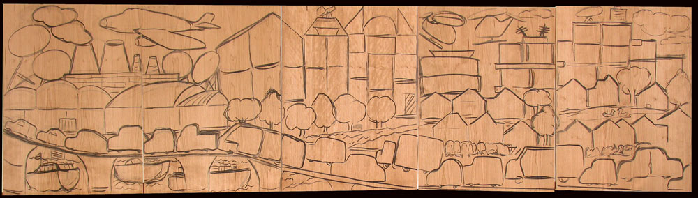
Subject: On the blocks!
Posted by: Maria
Anyhow, there it is, looking more and more like a true puzzle. Each piece is about 5-6 x 5-8 inches, some are irregular. There are about 106 pieces, ready for all the participants to fill with wonder. Next step is to ink the design with sumi to make the final adjustments, the drawing permanent and the individual blocks defined. Shouldn't take a half-day. After a good sanding and staining with walnut ink on both sides to make carving easier, the puzzle-piece cutting begins, that all should take about two days at most. I bought a piece of thick styrofoam to support the wood and avoid all that twirling, thank you Doug Haug for reminding me of that jig-saw technique. More pictures as I chop chop. I finally finished another two projects so my attention is fully on this task until the blocks fly out the door, so to speak. |
This item is taken from the blog MCPP Puzzle Prints.
'Reply' to Baren about this item.