Today's postings
- [Baren 45543] stencils (Guadalupe Victorica)
- [Baren 45544] Exchange #53 (Monica Bright)
- [Baren 45545] RE: water based inks with stencils ("Phare-Camp")
- [Baren 45546] Re: water based inks with stencils (key sevn)
- [Baren 45547] Re: Oh, sketch heaven (Marilynn Smith)
- [Baren 45548] Re: Oh, sketch heaven (Jeff Simpson)
- [Baren 45549] Baren Member blogs: Update Notification (Blog Manager)

Message 1
From: Guadalupe Victorica
Date: Wed, 30 May 2012 14:05:39 GMT
Subject: [Baren 45543] stencils
Send Message: To this poster
I have used the over head transparencies with linoleum. Sometimes I ink the transparencies with a different color as the linoleum,and place it on top of the linoleum. Other times I just block the ink from the linoleum. Guadalupe Victorica
Fifth International Prints for Peace 2012, Fourth
International Printmaking Collective
2012
http://www.printsforpeacemexico.blogspot.com/
printspeace@gmail
Message 2
From: Monica Bright
Date: Wed, 30 May 2012 14:28:18 GMT
Subject: [Baren 45544] Exchange #53
Send Message: To this poster
-Monica Bright
Message 3
From: "Phare-Camp"
Date: Wed, 30 May 2012 20:24:06 GMT
Subject: [Baren 45545] RE: water based inks with stencils
Send Message: To this poster
step in my prints for years. I make the stencils from clear plastic inkjet
transparencies and use a woodburning tool with the exacto blade attachment
to cut the stencils (makes for cleaner curved cuts). It helps to rinse the
inkjet coating off of the transparency. I use stencil brushes to gently
"ponce" the ink thinly over my dried prints. This last semester some of my
students used akua intaglio inks with stencils. I also experimented with
them. They worked great straight to paper and thinly atop thin layers of
akua but not so good over dried graphic chemical ink.
Just experiment, have some fun. The more you experiment the more likely you
are to find what works to best to get the results you want.
Patti P-C
Message 4
From: key sevn
Date: Wed, 30 May 2012 22:34:26 GMT
Subject: [Baren 45546] Re: water based inks with stencils
Send Message: To this poster

Message 5
From: Marilynn Smith
Date: Thu, 31 May 2012 06:58:29 GMT
Subject: [Baren 45547] Re: Oh, sketch heaven
Send Message: To this poster
thought of it. My daughter left national geographic magazines for the
hubby to read. I come in without my paper back. Pick up the National
Geographic about the Civil War. Guess what? One featured article was
about the artists that were hired to follow the troops and send back
drawings about the war. Whoa in those moments sitting around waiting
and just being there i could draw. A new sketch book and I was off to
who knows where and who cares where? Scribbles, lousy drawings and
than something and fun with just a sharpie and who cares what mess I
make? One never knows where life will go but always let your art help
lead the way. Throw caution to the wind and let it flow good or bad.
It may lead to your next thread, your next level, your next woodblock
series. Don't block art and life for money. I do understand one must
pay the bills.
I hope for each of you that in the end you have no regrets.
Marilynn
Message 6
From: Jeff Simpson
Date: Thu, 31 May 2012 07:02:14 GMT
Subject: [Baren 45548] Re: Oh, sketch heaven
Send Message: To this poster
Digest Appendix
Postings made on [Baren] members' blogs
over the past 24 hours ...
Subject: Letterboxing Stamp
Posted by: Ellen Shipley
|
Back to carving -- this time a letterboxing stamp for my sister. Thanx Lana Lambert of Pistoles Press http://pistolespress.blogspot.com/ for the chunk of EZ Cut to play with. Here's the sketch of a baby elephant, with the initials JB:   |
This item is taken from the blog Pressing-Issues.
'Reply' to Baren about this item.
Subject: Ishikawa-san gets going ...
Posted by: Dave Bull
|
We had a real traffic jam here the other day, with six of us all trying to work in the same small space together: Yasui-san was mounting prints for HangaClub, Tsushima-san was printing, Ishigami-san and I were putting up a new door and getting material ready for construction, and both new trainees Miyashita-san and Ishikawa-san were here. So Tsushima-san used my workspace, and the two trainees took turns on the other printing bench, but we can't continue that way, as they waste half their time. So I got busy yesterday and built another printing workstation, and it went into service this morning when Ishikawa-san gave it a tryout: 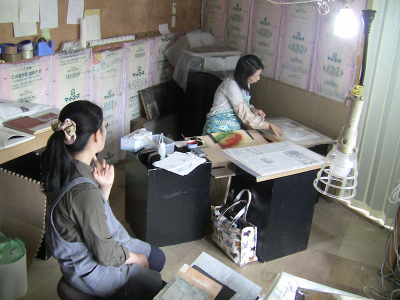 |
This item is taken from the blog Mokuhankan Conversations.
'Reply' to Baren about this item.
Subject: Indecision
Posted by: Andrew Stone
|
Well, I printed three or four impressions yesterday and I'm getting close to the critical decision....how to deal with the last background. I have had some pretty clear ideas but as my children, spouse, and pretty much anyone who has seen the prints in the last few days have pulled out my favorite as the immediate discard so I'm wavering about whether to pay attention to my inner voice or heed the growing number of voices that agree with Alex the 14 year-old pragmatist, "Dad, that's just plain UGLY". My Beetle and grub prints were pretty "ugly" too (but I like them a lot) so with this print I wanted to do something a little more visually appealing but the yellow version risks being too pretty. Here is yesterday's test of the last block which I coated lightly with matte acrylic medium proofed on drawing paper. (This is cheap paper so the surface and printing quality is very different from the carefully printed/good paper version from my last post.) I've printed a thin layer of aquamarine/pthalo blu over the yellow background. The sealed block no longer prints the two vertical seams but gives a pronounced speckling, goma-zuri effect. It would need another impression to deepen/darken the background color.   The next block will be printed multiple times in overlapping colors/unevenly to try to get a little more depth. The colors that come next will greatly affect the overall look and balance; If I push the blue and earth-green pigments it will be more "natural" and there will be a little of the Blue-Orange interaction. If I print again with violet/mauve it goes towards the brown and gets more moody. If I print again with a deeper yellow it will stay pretty much as is. Here are most of the proofs done for color testing/registration over the last few serious printing trials:. |
This item is taken from the blog Lacrime di Rospo.
'Reply' to Baren about this item.