Basic Process of Making a Print (entry by David Bull)
The Traditional 'Key Block' Method
With a keyblock - or without? Are there really only two ways to make a woodblock print? No, of course there are many many different ways to approach the construction of a print; it is simply that woodblock prints generally fall into one of two major types - those with an outline (usually in black) that defines the boundaries of all the shapes in the image, and those with no such line present.
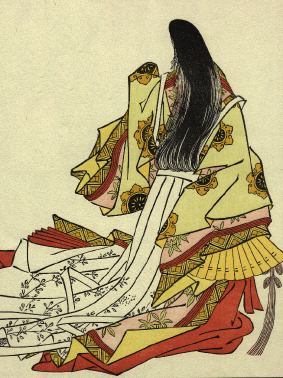
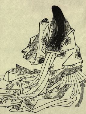
The most famous examples of the outline type are of course the prints created in the Japanese traditional manner. Indeed, in these prints the colour can in many cases be considered an afterthought; the outline stands on its own as a complete image.
Prints made without outlines however, depend on the colour masses and their arrangement to create the image. Black may be present, but if so it is usually treated no differently from the other colours in the print. (Illustration of a print by Matt Brown)
As would be expected from such dramatically different concepts of what a print should look like, the construction of the two types follows quite different methods ...
With Keyblock ...
The most interesting aspect by far of the traditional outline-based woodblock print, is the fact that until the last of the colours has been printed on the proof copies, no one will ever have seen the image in its entirety. The outline drawing existed at one stage, so the general shape of the image was clear, but how it was to look in final 'full-colour' splendour was something that only existed in the designer's mind. It's much like the creation of a piece for symphony orchestra - the composer himself can presumably 'hear' the piece, but until all the parts have been copied, and all the musicians assembled, the music doesn't have any actual existence.
The first step is of course a sketch of the design. Although it is indeed possible to dispense with this, and simply attack a piece of wood with some sharp tools, most of us need to be a bit more organized than that ...
Once the design is 'ready' it must be translated into a form suitable for cutting on wood. One common way to do this is to use a thin paper (tracing paper, or a thin Japanese paper known as minogami) and, using brushes or pens, carefully draw each of the lines. The image is not reversed for the woodblock, but drawn in 'normal' orientation.
No indication of colouring is made at all. At this point, nothing but the outlines are needed. In addition to the image itself, it is necessary at this point to add the registration marks (kento). These will be carved onto the wood along with the design, and will enable the paper to be placed in precise position for printing later.
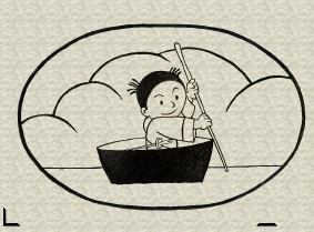
This finished sheet is known as the sen-gaki (outline drawing) or the hanshita (tracing for carving). Here's an sample - using a print I made a few years ago for a children's printmaking workshop.
The hanshita is pasted face down onto a suitable piece of wood, and it is this face-down orientation that performs the essential step of reversing the image for the block. If the paper used was thin enough, the image will now be visible through the back; if a Japanese paper such as the minogami was used, it can be gently rubbed at this point to remove most of the fibres, leaving the image clearly visible on the wood.
The block is now carved. (Five easy words to say!)
The two parts of the kento are also carved (the 'L' shaped corner mark, and the straight mark).
Once the key block is ready, work on colour separations can begin. In order that blocks for the colours can be carved accurately, a number of impressions are now printed from the key block - as many as there are to be colours in the final print (plus a few for 'extras' ...)
One point of confusion for beginners comes up here - these impressions are not printed in the 'normal' way, with the paper inserted into the kento as common sense would dictate, but are printed with the paper laid over the entire piece of wood. Pigment must be rubbed over the entire image including the kento marks. In this way, the placement of these registrations marks will be clear on the colour separations, allowing matching marks to be carved in the corresponding locations on the colour blocks.
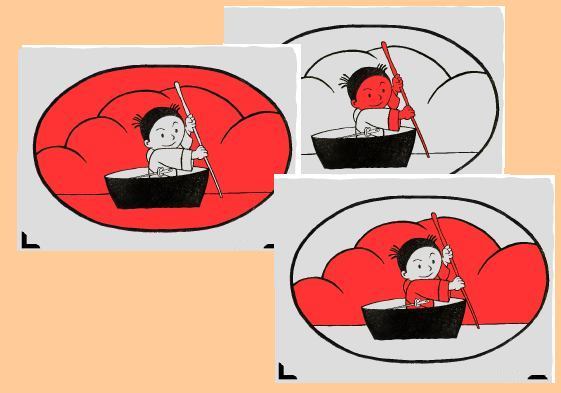
The next step is also surprising for beginners - the colour separations are made, not using the colours that are expected to appear in the final print, but with anything that is handy. In the old days, it was common for a vermillion pigment to be used to deliniate each area of colour, but as a water-based pigment tends to cause the paper to expand and distort, I find it better to use a modern fluorescent marker.
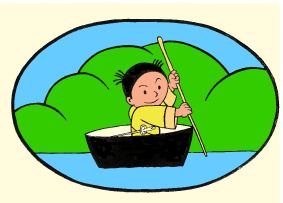
One sheet is used for each colour, and the marker is used to carefully fill in the appropriate areas. Any areas that are left blank on all the sheets, will appear as blank white areas in the finished print (the inside of the 'boat' in this example). Any areas that are coloured on more than one sheet, will be areas of overlaid colour (the background trees, his cuffs, the stick ...).
(A common 'trick' when the separation work is done, is to stack the sheets on top of each other and hold them up to the light. This will show up any areas that have been missed in the colouring - a very easy error to make ...)
Each of these sheets is then pasted down on a fresh piece of wood - again face down - and they are carved, including the kento marks. Carving a colour block simply consists of removing everything that isn't 'red' - out to a distance of about 3~4 cm away from the retained areas.
Once all the carving is finished the printing process begins, and this follows the same general order as the carving - the key block comes first, the colours next. In this way, each colour block can be carefully adjusted so that the colour will fit exactly between the outlines. (In the traditional Japanese style of printmaking, the pigments were nearly always a transparent type, so there was no problem with opaque pigment covering the lines.)
|
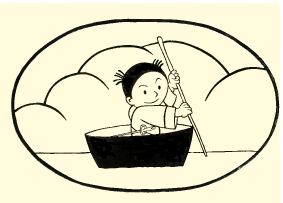
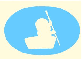
Impression of the key block |
|
|
Impression of the first colour block ... |
The two combined ... |
|
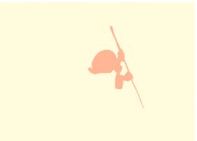
Impression of the second colour block ... |
The three combined ... |
|
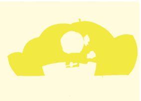
Impression of the third colour block ... |
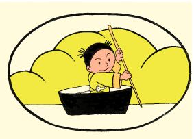
The four combined ... |
So in this example, four impressions serve to produce a print of six colours, due to the areas of overlap between colours. Note again - the colour blocks span wide areas, including places where black is printed - the face for example. But because the pigments are transparent, even though the colours are printed on top of the black lines, those lines show clearly in the final print.
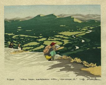
This 'key-block plus colours' method of working is capable of producing prints of astonishing complexity, as any glance through a book on traditional Japanese prints will show ...