Carved lines in Japanese Traditional Prints - How do they differ from the 'originals'? ... a discussion.
Editor's note: The comments you are about to read have all been 'clipped' from a discussion on this topic that took place on the Shogun Gallery 'Chats on Japanese Prints' discussion forum in the autumn of 1998. They are reproduced here with the permission of the contributors, and of Mr. Gary Gestson of the Shogun Gallery.
The Shogun discussion board, which is highly recommended to anyone with an interest in Japanese prints, is located at:
http://www.shogungallery.com/wwwboard/wwwboard.html
(This discussion is actually the continuation of one that started on a different topic - the 'balance' between the designers and the craftsmen who made the prints. We pick things up at the point where the topic 'morphed'. John Fiorillo is responding to comments by David Bull about the beauty of prints ...)
Posted by John Fiorillo on October 31, 1998
...
A few other thoughts:
(1) You say that print lovers admire the "clarity and definition of the incised lines, and the beauty of the fluid 'brush' strokes - the indescribable delicacy of the colours, and the way that two colours side by side 'blend' with each other perfectly." You are basically correct, of course. I think, for example, of late period Osaka prints (after c.1855) where many of the compositions were standard fare, but when they were issued in deluxe editions that employed luxurious pigments (including metallics) and advanced printing techniques (gradated shading, embossing, overlapping colors), the art of the carver and printer raised those works of art to higher levels in spite of the artists' merely conventional designs.
(2) I would partly modify, however, your statement about the 'fluid' brush strokes you cite in woodblock prints. While it is true that master carvers and printers could achieve amazing results in translating the nature of the Japanese brushed line into woodblock prints, the lines in block prints typically did not match the fluidity of the brushed line and were in many, if not most, cases rather rigid in comparison. In fact, I think you put you finger on it when you also mentioned the 'clarity and definition of the incised lines.' While the lines in block prints could be sweeping and beautifully curved, block lines nevertheless tended to be sharply defined because they are cut into wood.
Hokusai is a case in point. If you compare his drawings to the final prints, you will see far greater energy and noticeably more 'calligraphic' qualities to his lines than those in the prints (this is somewhat apparent in your website illustrations, though it's harder to demonstrate this point using only digital scans). Another example involves prints and drawings of the same designs by the Osaka artist Hirosada, where it can be demonstrated that the lines in the drawings possessed a calligraphic, slightly uneven, and more lively quality than did the carved block lines, which were quite uniform and had the appearance of 'banded wires' rather than brushed lines. This is especially obvious when observing the lines of the drawings and prints under slight magnification.
I would say that the nature of the woodblock medium requires that the incised lines be clear and uniform rather than lively and expressive because the engraver must carve his lines into a very hard surface and cannot possibly achieve the freedom of the brush. Thus what passes for fluidity in prints is different from the fluidity created directly by the artist's brush.
Posted by an unidentified contributor on October 31, 1998
An amendment to John's second point: it certainly wasn't always the case that the sweeping lines of the original brushstroke were translated into uniform lines. Interestingly, that seemed to come with the introduction of color printing, when the importance of line took second place to color. The primitives often have expressive, brushlike line quality, as do many works of book printing (particularly outside of ukiyo-e). But there were exceptions to this general translation of wavering brushstroke to uniform printed line throughout the 19th century as well. One of my favorite prints from my collection is an early (1814) Kunisada with wonderful brushstroke-like qualities.
My hunch is that in commercial printing, particularly as demand rose, it became easier to carve unwavering straight lines rather than the thick and thin expressive style of a brush. Just look how stiff and angular the later prints got.
I suppose Dave could give us some insight about this. How about it?
Posted by John Fiorillo on November 1, 1998
Yes, I agree, there were exceptions to the rigid, precise lines often found in woodblocks, and you offer a good point about the effect of color printing on the styles of line carving. The so-called nishiki-e (brocade prints) often required precise registration of many color blocks, so the carvers could not be free or too expressive with the contours of their lines. Generally the carvers formed lines that were either quite uniform (as in middle and late period Osaka printmaking) or varied only to a modest degree in thickness or shape. When they wanted to imitate a brushed line, they would typically eliminate the hard outline and print only the color in a more dilute wash.
There are certainly many examples of 'painterly' effects in woodblock printing - many privately issued surimono include marvelous printing effects, as do many prints that employed landscapes or backgrounds influenced by the Shijo or Kano schools of painting. Some ukiyo-e prints were interesting hybrids of styles in which, for example, the actors were portrayed in the precisely outlined, densely colored ukiyo-e style while backgrounds were executed in washes of color areas without any outlines at all. There are also examples of very expressive block printing techniques well into the twentieth century.
Still, my point was that what has been called (in James Michener's fanciful phrase) the 'singing line' of woodblock prints typically had its own qualities that differentiated it from lines put down by an artist's brush. No matter how skilled the block carvers and printers were, if you compare the same design done in both a block print and in a painting or drawing, you would still see a difference in how the pigment spreads across the paper, regardless on how effectively the artisans imitated the effect of the brush. This would seem to me to be the result of the essences of the two media: in brush painting the pigment is placed on the sheet via bristles of varying stiffness or flexibility, and by a hand that controls the loaded brush with varying tension, which results in variable densities and coverage throughout the stroke; in block printing, the paper is rubbed on the wood surface after pigment is applied to the block. While it is true that the printer can apply the pigment to the block differentially (in gradated shading, for example), or rub with different degrees of pressure, the act of pressing down the paper and then rubbing it from the back necessarily results in an effect different from a line brushed directly on the paper. In block printing there is still greater uniformity in the application of pigments to the paper.
I, too, would be interested in David's comments on this discussion.
Posted by Dave Bull on November 1, 1998
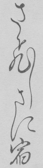
Hmmm... Again, I have perhaps an extreme view of this. I've spent the past ten years carving some of the most fluid Japanese calligraphy into hard cherrywood blocks. Maybe I've succeed, and maybe I've failed, but I certainly hope that 'rigid' is not the term that describes what I've been doing! And judging from the comments that I receive from collectors of my prints, many of whom buy them specifically because they love calligraphy, I'm perhaps not too far off ... Here's an example. Rigid? Fluid?
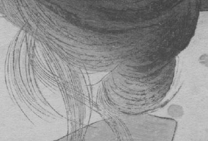
But block lines too can be as uneven and lively as needed. This next example is not from my own work, but from a Meiji-era print. 'translating the nature of the Japanese brushed line into woodblock prints ...' Yes!
What we need is for someone to come along and write a well-balanced book that delves deeply into this topic of the collaborative process. I am far too much tilted to one side to be that person. John, maybe you're the man to do this? Or are you perhaps too much on the 'other' side? Boy I'd love to read it!
Posted by John Fiorillo on November 2, 1998
David, your examples are, of course, quite compelling. Your own calligraphy carving is certainly not 'rigid' in the sense of it's being 'without life' - rather, what I meant was that by carving the line into a block there is a tendency for carvers to define precisely the outline or edge of the line in a rather uniform manner. Still, the Meiji example really does show what can be done when an expert carver decides (or is directed) to imitate the brush, particularly a brush loaded with drier pigment or less dilute pigments, which when applied give a broken quality to the forms of the line.
I suppose I overstated the idea of 'rigidity' in block carving, although I did use the term 'typically' and did not mean to say all examples of block printing were 'rigid.' I was also thinking of the standard repertoire of ukiyo-e carving in which the keyblock lines were 'typically' done in a uniform manner and were meant to enclose color areas. These lines were partly derived from conventions in traditional yamato-e ('Japanese painting') used in handscrolls of the Heian period (794-1185) where highly decorative effects were achieved, characterized by areas of opaque colors set within strong outlines. Its stylistic conventions included the hiki-me-kagihana ('slit-eyes and hook-line nose') for the drawing of the face, adapted by ukiyo-e artists five centuries later. After the Heian period the yamato-e tradition of painting flourished particularly in the Tosa school, and even the Kanô painters (followers of Kanô Masanobu, 1434-1559), who worked primarily with modulated brushwork in the Chinese manner, had by the sixteenth century incorporated elements of yamato-e into their paintings. Nevertheless, ukiyo-e artists and artisans frequently worked in eclectic styles, both cursive and 'controlled,' and thus we can see elements of both approaches in surviving woodblock prints.
I would still repeat my earlier follow-up statement (posted 11/2), for I would wager that if you compared the details of the Meiji hairdo done in blockprinting with the sketched original, you would still see a difference in how the pigment spreads across the paper, regardless on how effectively the artisans imitated the effect of the brush. This is the result of the nature of the two media: in brush painting the pigment is placed on the sheet via bristles of varying stiffness or flexibility, which turn, flare out, separate, and fold under each other as the brush travels across the sheet. This gives the brushed line a different character, and the edges of the lines are often quite different. The hand that controls the loaded brush does so with varying tension, which results in variable densities and coverage throughout the stroke, whereas in block printing the paper is rubbed against the wood surface after the pigment is applied to the block. The act of pressing down the paper and then rubbing it from the back necessarily results in an effect different from a line brushed directly on the paper. In block printing there is still greater uniformity in the application of pigments to the paper, despite even such wonderful examples as the Meiji coiffure in your second picture.
Posted by Dave Bull on November 3, 1998
Yes of course the two things - a painting ... and a print - are completely different animals, and I don't quite know how this discussion got turned around so that I seem to be arguing the opposite viewpoint! I love prints for what they are and not for what they imitate.
I had a specific reason for choosing those two particular examples of calligraphy. The first is from my current series of Katsukawa Shunsho's Hyakunin Isshu prints. The second is a Meiji-era kuchi-e that will be included in my new series that starts next year. For ten years now I have had no choice but to follow the same carving style and the same printing style as I worked on the long series. There are actually dozens of different ways to carve lines and calligraphy, and many more than dozens of different ways to put the pigment on the paper. But I have been unable to explore these techniques, due to the fact that I have had to maintain consistency in the series. But starting next year I have no such restriction.
Whether or not I will be able to successfully reproduce the sabi-bori ('dry brush') effect in that Meiji print remains to be seen. But I'm going to have a lot of fun trying!